Finding Their Voice: Asha Speech Pathology
DESCRIPTION
Asha Speech Pathology is a practice rooted in empathy, personal insight, and clinical expertise. With a Master of Speech Pathology and lived experience as a parent of a neurodiverse child, the founder brings a uniquely compassionate approach to therapy. The practice focuses on guiding families and the child through communication challenges—from speech delays to literacy issues—offering support every step of the way. Asha’s philosophy is simple yet powerful: “Let’s talk it out”—because every voice deserves to be heard and understood. Branding for them was an extremely exciting journey.
ABOUT CASE
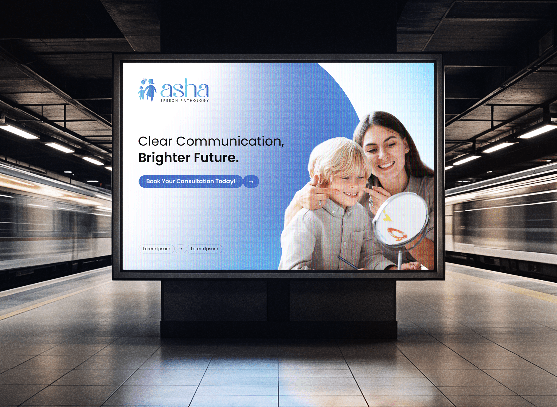
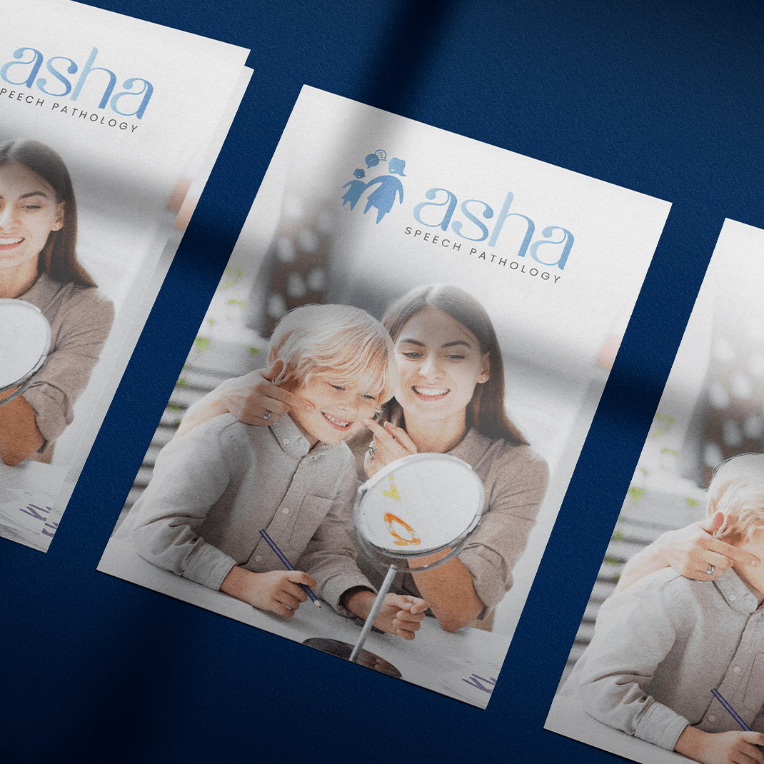
We collaborated with Asha Speech Pathology to build a brand identity that reflects its heart-led mission. Our services included logo development, branding, brand tagline creation, a carefully curated colour palette, and a fully responsive website. The goal was to craft a visual and verbal identity that communicates warmth, trust, and professionalism while empowering families and individuals to seek support confidently. From the logo to the site’s tone and layout, every detail was designed to echo Asha’s message of hope and collaboration.
CASE LAUNCH
November to February 2024-25 – Melbourne, Australia – branding, logo development, brand tagline, colour palette and website development
Case Approach
Our approach to building Asha Speech Pathology’s brand identity was rooted in empathy, strategy, and storytelling. We began with in-depth discovery sessions to understand not only the professional scope of the practice but the personal journey that inspired it. This allowed us to capture the founder’s unique perspective—blending clinical excellence with lived experience as a parent navigating the world of neurodiversity.
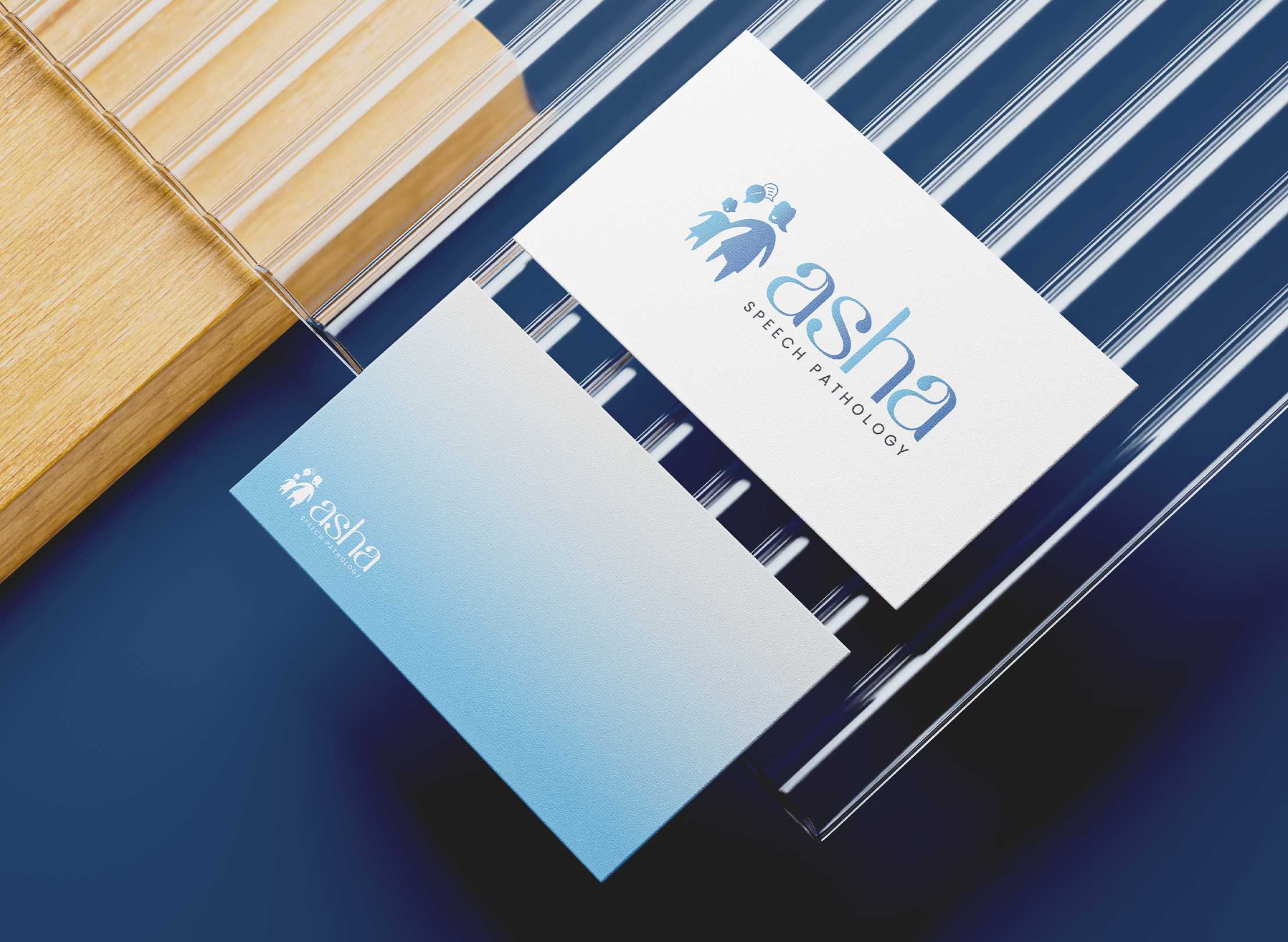
From the outset, we prioritized emotional resonance. The brand needed to feel approachable and comforting while still reflecting credibility and professionalism. We chose a soft, soothing colour palette designed to convey warmth and calmness, ideal for families who may be feeling overwhelmed. Typography was selected for its readability and friendliness, reinforcing a tone of openness and clarity.

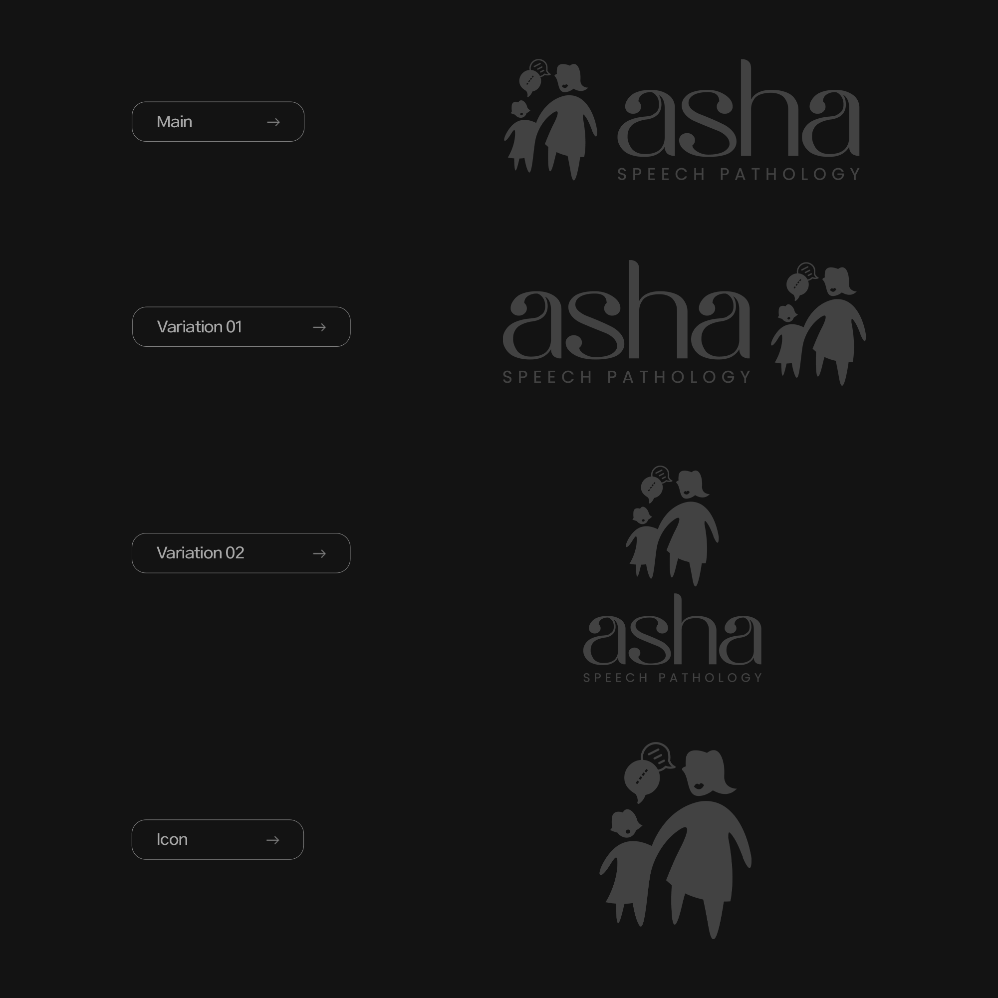
Logo development focused on symbolism—representing connection, growth, and communication in a subtle yet memorable mark. We explored several iterations before finalizing a design that balanced trust and approachability.
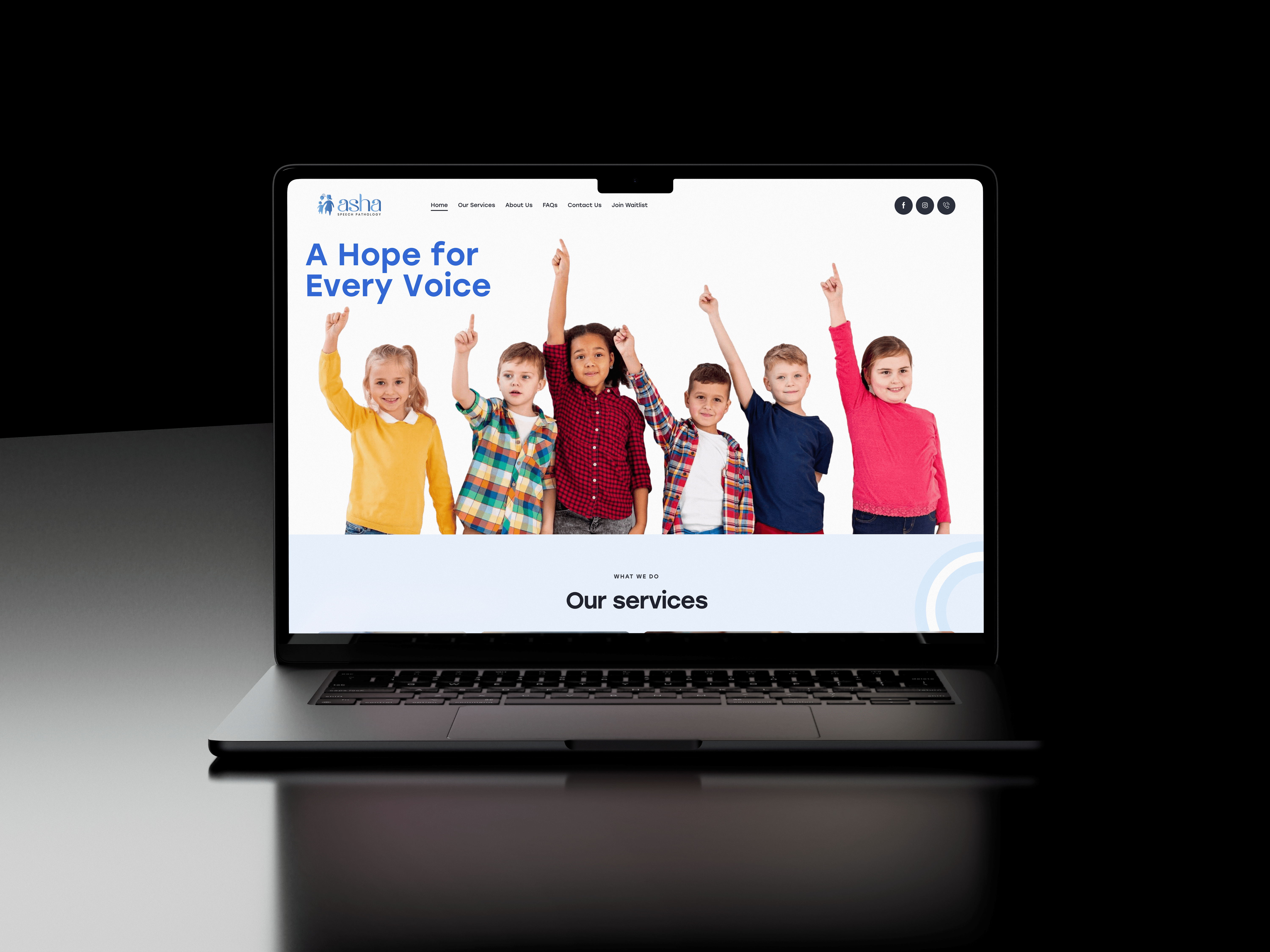
For the website, we adopted a user-first approach, ensuring intuitive navigation, clear service information, and calls to action that gently guide users through the journey of seeking help. Content was written with empathy at its core, addressing concerns parents might have and reassuring them that they are not alone.

Throughout the project, we maintained close collaboration with the founder to ensure every element reflected her voice and vision. The result was a brand and digital presence that not only informs—but uplifts and empowers.

CASE GOAL
Our objective was to establish a cohesive and heartfelt brand presence for Asha Speech Pathology—one that reflects its mission of support and connection. We aimed to build trust at first glance through thoughtful branding and ensure that the digital experience would empower users to reach out confidently. From brand identity to website launch, the goal was to authentically express Asha’s promise: to walk with families through every step of their communication journey.
